Brand guide
Vesper & Vine
How the Vesper and Vine cellar door sample site looks, sounds and behaves. A fictional brand, made by Maddrell Design to show what a complete small-business web presence includes.
1. Wordmark
- Set in Instrument Serif, with the ampersand in italic and in the accent: Warm Light on dark, Wine Light on light.
- “Cellar Door” sits beneath in Jost, uppercase, widely tracked, at about one third the height of the name.
- Clear space on every side equal to the height of the &. Never below 24px tall online. Never stretched, outlined, recoloured or placed on busy areas of a photograph without the dark gradient.
2. Palette
Drawn from the photographs: deep wine, stone and concrete, vine green, warm evening light.
Deep Wine#4A1824
Primary dark. Feature bands, buttons.
Wine Light#6B2433
Hover and emphasised words on light grounds.
Cellar Ink#1D1412
Footer, dark bands, body text.
Bone#F4F0E8
Default page ground.
Stone#E4DCCD
Quiet alternate band.
Warm Light#C8A15A
Small accents, focus rings, eyebrows on dark.
Vine Green#46502F
Reserved for rare accents and print.
Text pairs used: Ink on Bone 16.7:1, Bone on Deep Wine 13.3:1, Ink on Warm Light 8.6:1. Warm Light is not used for body text on Bone.
3. Type
A refined display serif for names and statements, with a quiet geometric sans for everything that must be read quickly. Both are free Google Fonts.
clamp 52 to 140px
clamp 38 to 78px
clamp 28 to 42px
clamp 30 to 60px
17px / 1.65
Every tasting is led by a member of the family or the cellar team. Tasting fees are refunded against two bottles.
12px, uppercase, tracking .26em
4. Photography direction
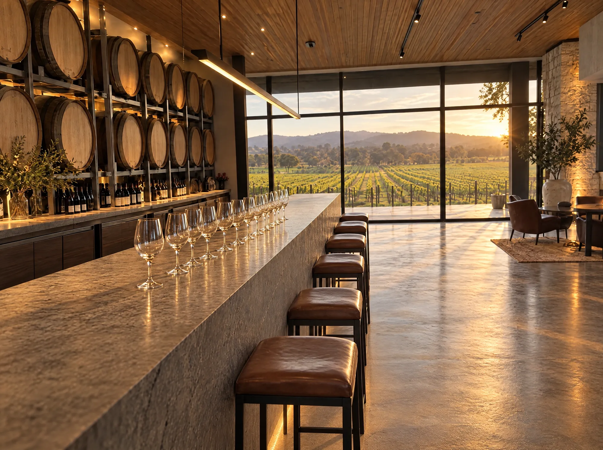
Light. Warm, low, and from the window. Golden hour or lamplight, never flat midday and never flash.
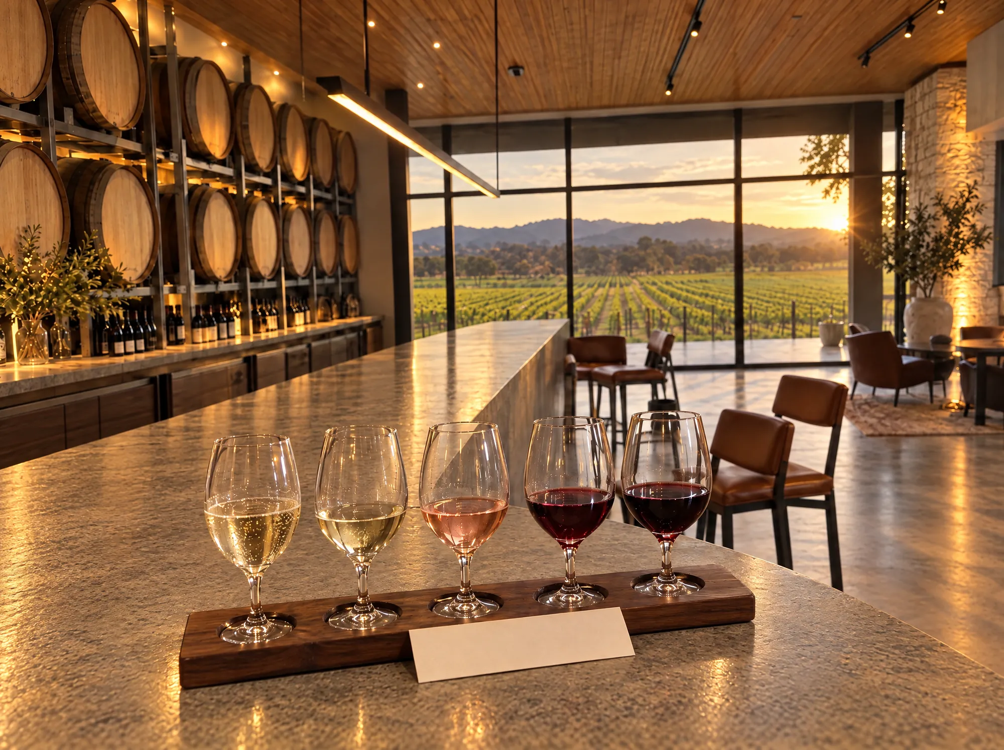
Subject. One thing in focus, the venue behind it. Glass, timber, stone, leather. White to red, always in that order.
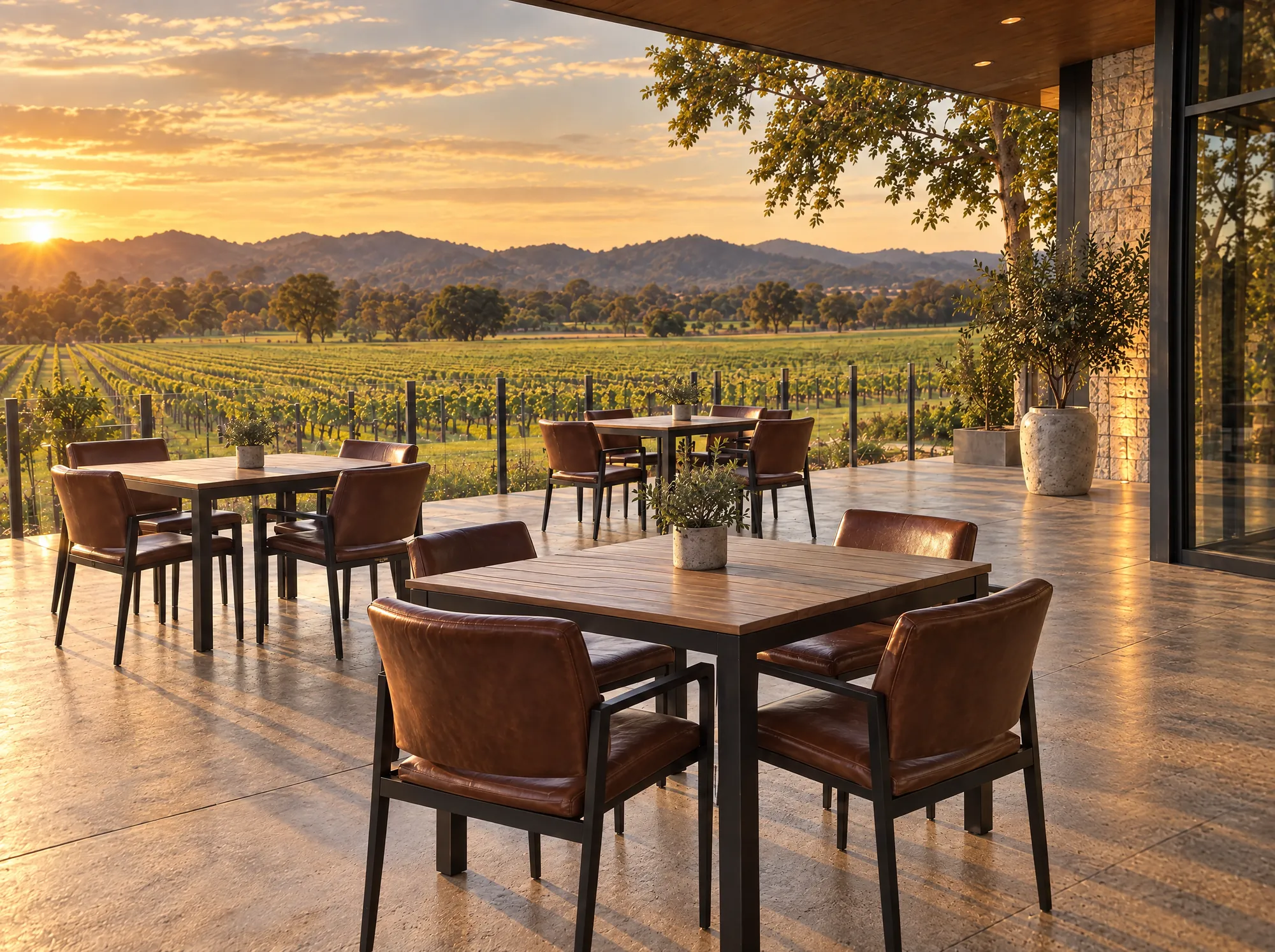
Place. Wide and generous, with the vines in view. Tidy: no vehicles, bins, cloths or mops in frame.
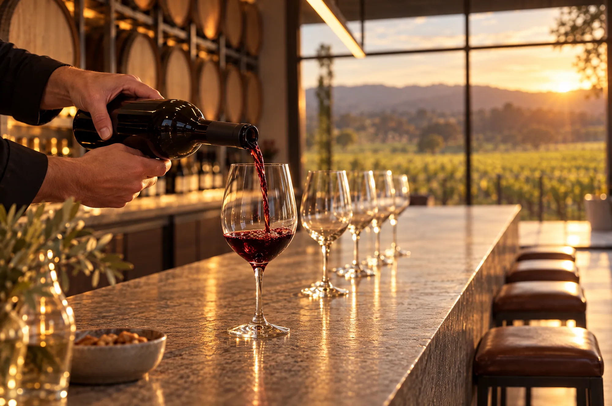
People. Hands, a pour, a host at work. Never a posed smile at the camera.
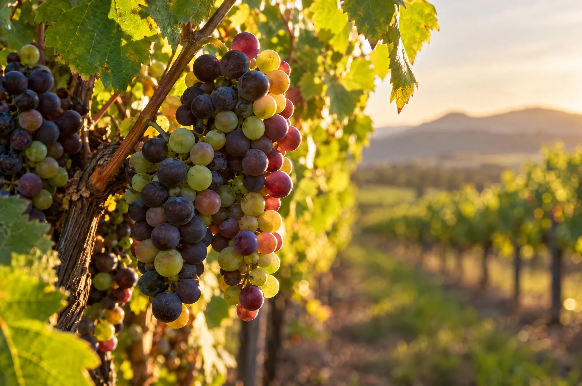
Detail. The fruit and the leaf, close, with the valley soft behind.
- Photography leads. A page opens with a full-bleed image, and text sits on a dark gradient, not a box.
- People appear as hands, backs and silhouettes, or hosts at work, never posed smiles at the camera.
- Grade warm and slightly low-key. Keep the whites cream, not blue.
- Where a photograph does not yet exist, a designed placeholder holds the place and says exactly what is needed.
5. Voice
Do
- Speak plainly, as a host would at the bar.
- Name wines simply: Dry Riesling, Pinot Noir.
- Give the time, the price and what is included.
- Use short sentences and let the photographs carry the mood.
Do not
- Use “curated”, “elevated”, “journey” or “passion”.
- Invent awards, ratings, reviews or press.
- Use exclamation marks or all-caps shouting.
- Promote drinking as a way to change mood or as a contest.
6. Components
Fields and time slots
Placeholder
Motion and access
- Slow fades only (about 1.3 seconds). Switched off for people who prefer reduced motion.
- Every control is at least 44px, with a visible gold or wine focus ring.
- Every photograph has descriptive alt text.
- Responsible-drinking line in every footer.