Brand guide
Harbour Table, in brief.
The rules this site follows, so the next menu, flyer or page looks like the same restaurant. Sample guide for a made-up client.
01 Wordmark
Plate over water.
The mark is a plate (circle) resting on the harbour line, with a short second ripple below. The wordmark is Fraunces Light, set in sentence case beside the mark.
Do
- Use stone on ink, or ink on stone or paper.
- Leave clear space equal to the mark’s width on every side.
- Keep the wordmark at 22 px or larger on screen.
Do not
- Recolour the mark or change the ripple to another hue.
- Set the name in capitals or add a tagline lockup.
- Place it on a busy photograph without an ink panel behind it.
02 Palette
From the water and the plate.
Deep harbour green-blue for ground, marble and stoneware neutrals for light, and one accent taken from the roasted carrot and charred crust. Ember is the only accent; it never appears as a second hue.
#0d2a30Header, footer, dark sections, primary buttons
#143940Panels and inputs on ink
#ede7daText on ink, alternate sections
#e2dac9Sample strip, light placeholders
#f6f2eaDefault page ground
#9a4220Accent on light: eyebrows, prices, links, focus
#e8956aThe same accent on ink
#566669Secondary text on light
#a8bfc2Secondary text on ink
| Pairing | Contrast | Use |
|---|---|---|
| Stone on ink | 12.3 : 1 | AA body text |
| Ember on paper | 5.9 : 1 | AA body text |
| Ember lit on ink | 6.4 : 1 | AA body text |
| Mute on paper | 5.4 : 1 | AA body text |
| Mute on ink | 7.8 : 1 | AA body text |
| White on ember (hover) | 6.6 : 1 | AA body text |
03 Type
A soft serif and a clear sans.
Fraunces Light for headlines and dish names; Instrument Sans for everything you read or press. Prices use tabular figures so columns line up.
| Role | Specimen | Spec |
|---|---|---|
| Display XL | Dinner at the water | Fraunces 300, 46 to 112 px, line 0.98 |
| Display L | Three plates to start | Fraunces 300, 36 to 70 px |
| Dish name | Braised lamb shoulder | Fraunces 400, 22 to 27 px |
| Body | Seasonal plates from a short menu, a wine list made for sharing. | Instrument Sans 400, 17 px, line 1.6 |
| Price | AUD 98.00 · 46 · 1,234 | Instrument Sans 500, tabular figures |
| Eyebrow and buttons | Spring menu | Instrument Sans 500, 12.5 to 14 px, tracked, capitals |
04 Photography
Close, warm, and unhurried.
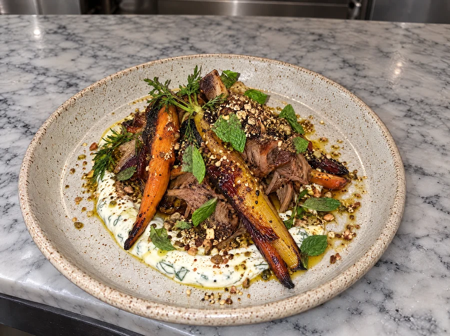
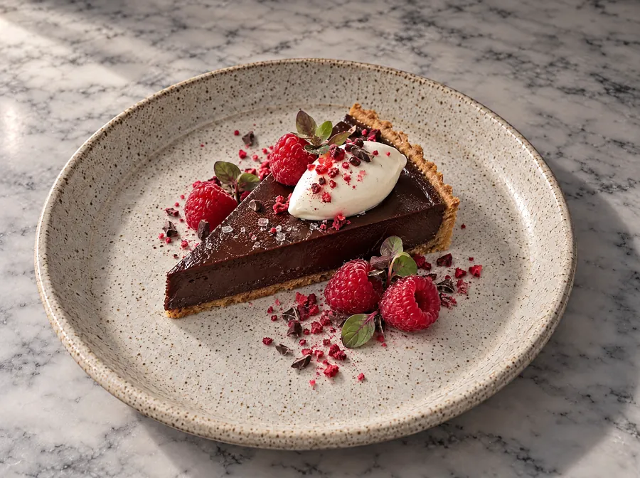
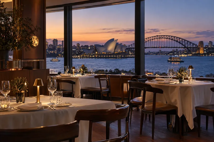
Each plate is shot from a high three-quarter angle on speckled stoneware over white marble, lit by one soft window. The food fills the frame; the table is quiet.
Do
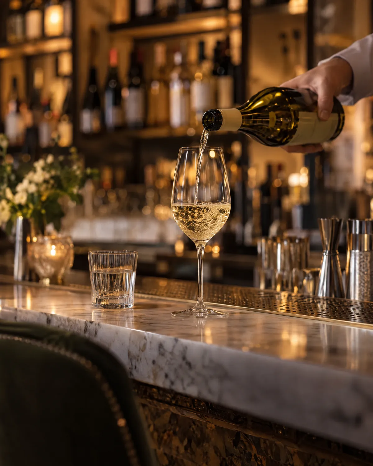
- Shoot natural window light, warm and low.
- Keep a 4:3 frame for plates; square only for thumbnails.
- Show the real food and rooms. The room and bar images here are generated stand-ins for this sample.
Do not
- Use stock images, flash, or heavy filters.
- Leave kitchen clutter in the frame.
- Fill a gap with a fake photo; use a labelled placeholder until the shot exists.
05 Voice
Warm, plain, and specific.
We write the way a good host talks: short, calm, concrete. We name the dish, the day and the price.
Do
- “Dinner Tuesday to Saturday from 5.30pm.”
- “Braised lamb shoulder, labneh, dukkah, mint.”
- Say what happens next after any form.
Do not
- “An unforgettable culinary journey.”
- Awards, ratings or quotes we cannot show.
- Capital-letter shouting, exclamation marks, or discount language.
06 Components
Square, flat, and quiet.
Every corner is square. Hover and press change colour only: no shadows, no movement. Targets are at least 44 px, and focus is a clear ember outline.
Form fields
Dish row and tags
Fennel and blood orange
21Shaved fennel, pickled shallot, toasted hazelnuts, dill.
Placeholder
Used only where a real photograph is on the shot list. Always labelled, never styled as a photo.
Layout and motion
- Corners: 0 px everywhere.
- Content width: 1320 px, gutters 20 to 72 px.
- Sections alternate paper, stone and ink.
- No scroll effects. Respect reduced-motion.
- Breakpoints checked at 375, 768, 1280 and 1600.