Home / Brand guide
Brand guide · Version 1
Stem & Stone, in one page.
How the brand looks, sounds and behaves, so every shop sign, email and page feels like the same florist. Written for the Stem & Stone team and anyone who designs for them.
1. Wordmark
Two words and an ampersand
The wordmark is set in DM Serif Display. The ampersand is the only coloured character and is never replaced with “and” in the logo.
Primary. Green on cream. Ampersand in rose (#C4708A).
Reversed. Cream on deep green, for footers, packaging and signage.
On blush. Same as primary. Use for editorial pages and cards.
Do
- Keep clear space equal to the height of the “S” on all sides.
- Use at 22 px or larger on screen, 18 mm in print.
- Use only the three versions above.
Do not
- Stretch, rotate, outline or add shadows.
- Recolour the ampersand to anything but rose.
- Set the name in another typeface or in capitals.
2. Palette
Garden green, cream and one rose
Green and cream carry the page. Rose is a single accent. Contrast ratios are measured against the background shown and meet WCAG AA (4.5:1 for body text).
Garden green · #22372DText, buttons, dark bands
12.3:1 on cream
Cream · #FFFAF6Page background
Base
Blush · #F7ECE8Heroes, summary panels
Green text 11:1
Stone · #EBE4D9Alternate bands, placeholders
Green text 10:1
Deep rose · #9B4E67Eyebrows, links, hover fill
5.5:1 on cream, 4.9:1 on blush
Rose · #C4708AAmpersand, bullets, large italic only
3.4:1: decorative and 24 px+ only
Deep green · #162720Footer
Cream text 15:1
Soft green · #4A5D52Secondary text
6.8:1 on cream
Rule: one accent per view. Never add a second hue, gradients or drop shadows. Hover and focus states change colour only.
3. Type
A serif for the voice, a sans for the work
DM Serif Display for headings, set in sentence case with italics for emphasis. Nunito Sans for everything else.
H1 · DM Serif Display
44 to 92 px, line 1.06H2
34 to 60 pxH3
24 to 32 pxEyebrow · Nunito Sans 700
12.5 px, caps, 0.2emLede · Nunito Sans 400
19 px, line 1.65Body
17 px, line 1.65Small
14 px4. Photography
Daylight, texture and real stems
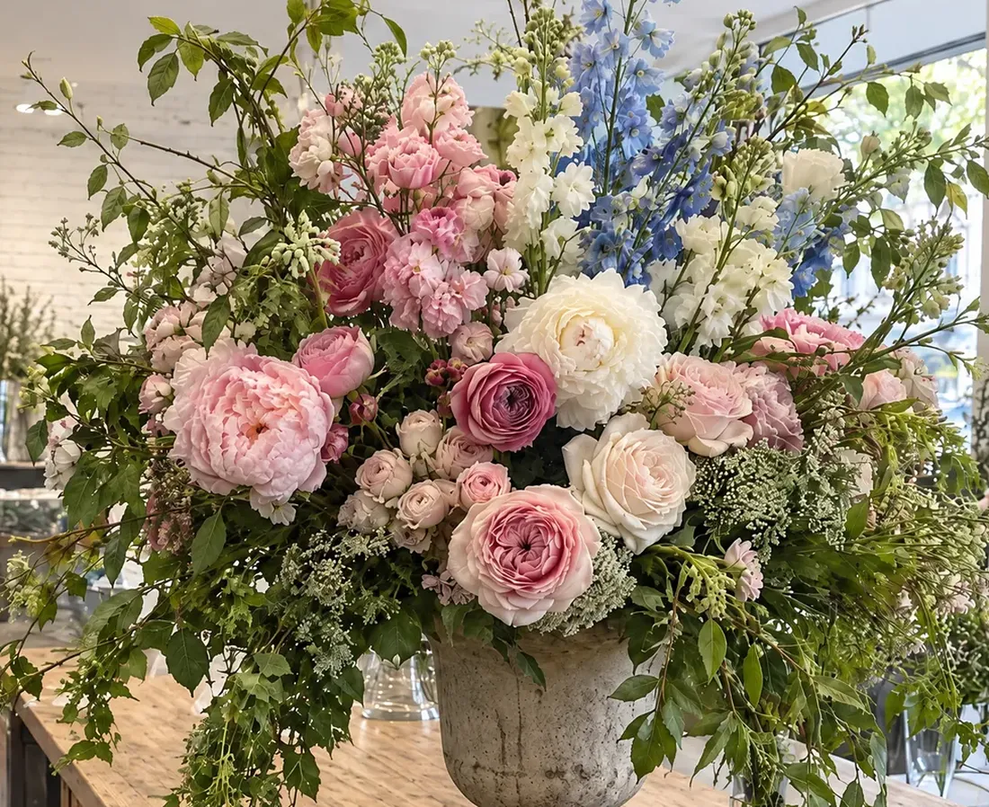
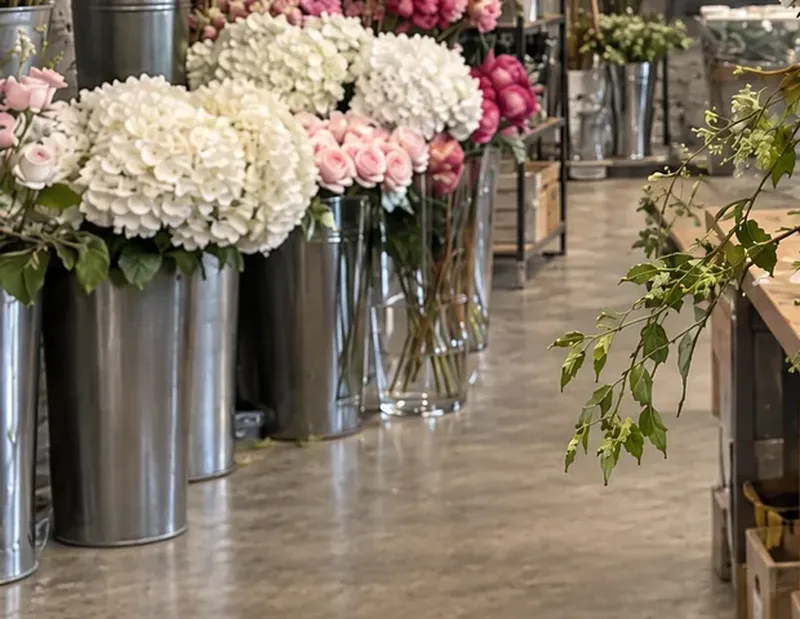
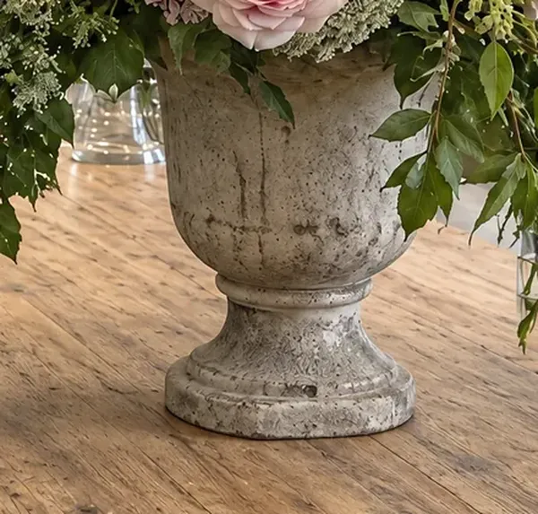
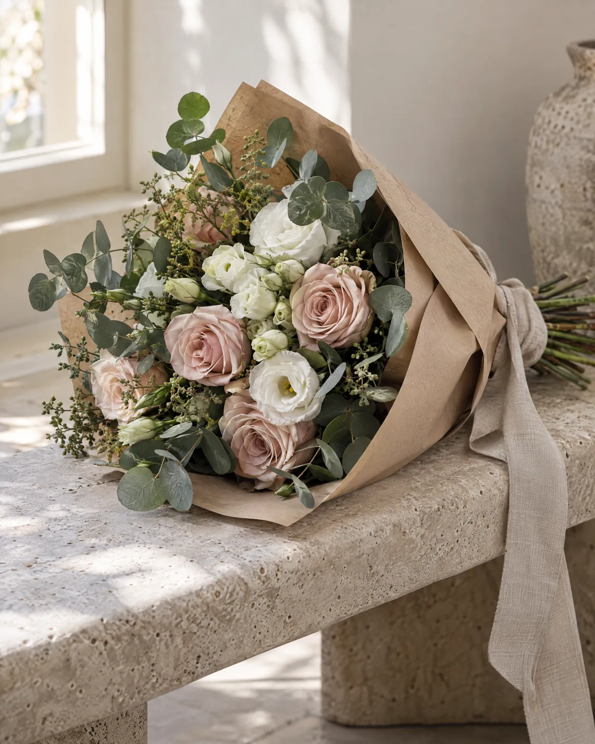
Photographs show the flowers as they arrive: loose, seasonal, a little wild. The shop is plain so the flowers lead.
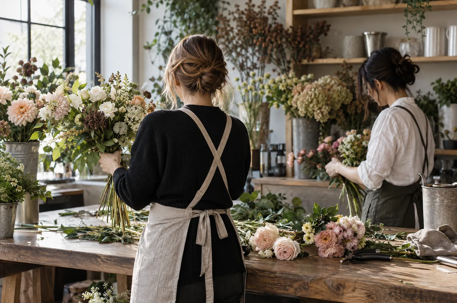
Do
- Natural window light, morning or overcast.
- Stone, timber, steel and white brick as the backdrop.
- Show scale: hands, a bench, a doorway.
- Crop in arches and circles; keep the flower as the subject.
Do not
- Flash, filters, heavy vignettes or stock bouquets.
- Props that are not in the shop: balloons, confetti, ribbon curls.
- Staged smiles. Candid work, hands and process only.
5. Voice
Warm, short, specific
We write the way a florist talks across the bench: plain, kind and about the flowers. Australian English.
Do
- Name the flower and the season: “peonies, for another fortnight”.
- Use short sentences and everyday words.
- Say what happens next: “We will call to check the details.”
- Give prices in AUD with the dollar sign.
Do not
- Use hype: “stunning”, “luxurious”, “curated”, “bespoke”.
- Use exclamation marks or emoji.
- Make claims we cannot show: awards, rankings, review quotes.
- Pressure: “last chance”, countdowns, fake scarcity.
Example
“Away for a fortnight? Skip it up to the night before. No fees, no phone calls.”
6. Components
The small parts, kept consistent
Radius language: pills for buttons, 20 px for cards and panels, 14 px for fields, arches and circles for photographs. Targets are at least 44 px tall. Hover changes colour only: no shadow, no movement, no scaling.
Buttons
Primary: green, hover deep rose. Secondary: outline, hover fills green. Focus: 3 px deep-rose ring.
Fields and choices
Cards and imagery
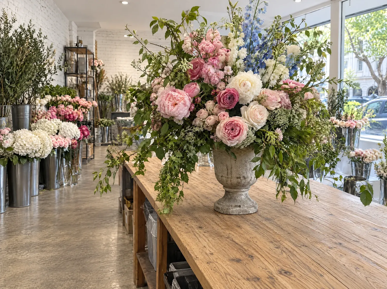
Arch for heroes, circle for categories, rounded rectangle for editorial. Missing photos use the striped blush placeholder with a plain label.